

Stop Shrinking Men's Watches and Calling Them Feminine: We Deserve Better!
Fashion Brainstorm
Women deserve better than a scaled-down afterthought. True feminine watch design is not timid, flimsy, or merely small. It is proportion, intention, grace, character, and a kind of quiet power that does not need to borrow its language from men.
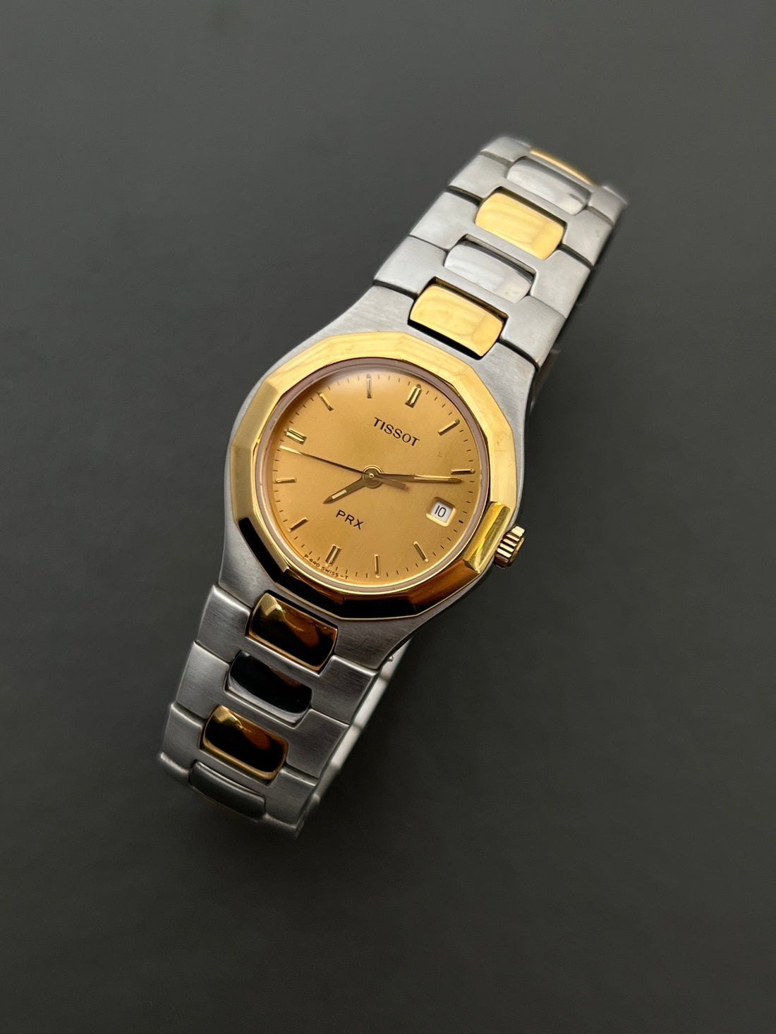
Gone are the days when watches for women were crafted with true femininity in mind. Not femininity as a marketing word. Not femininity as a smaller case size and a softer campaign photo. Real femininity in design: considered, elegant, deliberate, and alive with its own visual intelligence.
The industry once understood this language intimately. Think of the delicate Rolex Chameleon, the dreamy Rolex Orchid line, the sculptural Cartier Tank, the gentle jewellery-forward Seiko Tisse pieces, and the early Omega De Ville designs that carried presence without ever becoming loud. These watches celebrated softness, refinement, and proportion. They were not apologetic. They were not miniature versions of something else. They were complete ideas.

Then the market changed. Tool-watch energy became the default mood. Bigger cases. Stronger shoulders. Heavier bracelets. Sportier bezels. Thicker wrists in the advertising. A language built for durability, depth ratings, and masculine presence began to dominate the room, and womens watchmaking was quietly pushed to the side.
Graceful lines were phased out. Delicate transitions were simplified. The intimate relationship between watch and wrist was treated as less important than looking current. Even once understated icons grew larger, sharper, and more imposing. We celebrate strength. We celebrate expression. But confidence does not have to arrive as volume. Confidence can be beautifully controlled.
Size is not the same thing as presence. A watch can whisper and still command the room.
A Philosophy Mismatch
Shrinking a men's watch and labelling it feminine completely misses the point. A Seamaster, an Oyster, a dive watch, a field watch, or a heavy integrated sports model was usually designed around masculine proportions from the beginning: broader lugs, thicker mids, flatter planes, stronger shoulders, and a visual weight that announces purpose before adornment.
That is not a flaw in those watches. It is their identity. The problem begins when a brand takes that identity, reduces the diameter, adjusts the bracelet, adds a champagne dial or a few diamonds, and calls the job done. The result often feels compressed rather than refined. The lines are technically smaller, but the attitude is unchanged.

Feminine design has always been its own discipline. It asks different questions. How does the case sit against the wrist bone? Does the bracelet feel like jewellery or equipment? Is the dial airy enough to breathe? Do the lugs soften into the strap, or do they jut out with borrowed aggression? Does the watch complete the outfit, or does it fight for dominance over it?
These details matter because women do not need a watch that has been made smaller for them. They deserve one that has been imagined for them. A smaller case alone does not create femininity. A shrunken men's watch is not a women's design. It is a compromise dressed up as an offering.
A Design on Equal Standing
Vintage watches remind us that boldness for women has always existed, but in a language entirely its own. It was never a smaller copy of mens design. It was a parallel way of thinking. It could be slim, square, oval, faceted, textured, gem-set, mesh-braceleted, bracelet-like, or quietly architectural. It could be romantic without being weak. It could be ornate without being silly. It could be bold without becoming bulky.
Look at the Cartier Tank, a piece that carries presence while remaining effortlessly elegant. Consider Longines La Grande Classique, impossibly slim yet visually striking, a study in proportion rather than power. Even vintage Tissot and Seiko ladies pieces, with softened integrated lines and gentle geometry, express confidence without aggression. The classic Omega De Ville models show the same idea. They are refined and architectural, but never loud for the sake of volume.


That is the magic modern watchmaking keeps forgetting. Feminine does not mean fragile. Feminine does not mean decorative in place of thoughtful. Feminine does not mean pink, petite, or passive. Feminine design can be sharp. It can be decisive. It can have edges, polish, weight, and authority. But the authority comes from harmony.
A beautifully designed ladies watch has a sense of occasion. It knows that a watch is seen in motion, not in isolation. It catches light when the wrist turns. It sits beside rings, bracelets, sleeves, silk, linen, knitwear, perfume, lipstick, and memory. It becomes part of a life, not a technical object strapped onto one.
The Wrist Is Not a Spreadsheet
Modern watch culture often speaks in numbers. Diameter. Lug-to-lug. Thickness. Water resistance. Movement type. Power reserve. These details have their place, of course. We love craftsmanship. We love precision. But numbers do not tell the whole story of beauty.
A 24mm watch can feel extraordinary if the case has tension, if the bracelet flows, if the dial carries light, if the crown is placed with care. A 30mm watch can feel clumsy if the proportions are blunt. A watch cannot be judged by size alone any more than a dress can be judged only by hem length. The feeling is in the cut, the balance, the negative space, the way it rests on the body.

This is why vintage watches still feel so refreshing. They were created before every design had to shout across a feed. Many were made for real wrists, real wardrobes, real evenings, real workdays, real rituals. They understood that a watch for a woman could be intimate and glamorous at once.
Ladies Vintage Gold Watches and the Return to Harmony
Design is slowly finding its way back. After years of oversized cases and masculine-coded shapes dominating the market, we are beginning to see a quiet return to proportion and softness. Even Seiko has revived the Tisse spirit through its Rebirth project, bringing back an eighties-inspired silhouette that feels gentler and more considered. Other brands have started revisiting their archives as well, searching for the lines and proportions they abandoned in the rush toward larger and louder.

But if the industry is only now realising that the original forms were the ones that truly worked, why chase the new interpretation when the original still exists in its purest state?

Vintage pieces carry the intention, the authenticity, and the craftsmanship that modern recreations so often try to imitate. The gold tone has softened with time. The case shapes feel human. The bracelets have a jewellery-like ease. The dials are not trying to win an argument. They are simply beautiful.
That is why our answer is simple: choose the original, not the imitation.
Our Curation Promise
At Gilded Hour we believe that a watch should do more than tell time. It should feel like an extension of the woman who wears it. It should reflect her taste, her history, and her way of moving through the world.
True femininity in design is not small. It is intentional, balanced, expressive, and deeply considered. As the industry rediscovers this truth, we remain committed to curating the pieces that never lost it: watches created with sincerity rather than trend, and with proportion rather than spectacle.
Choose what feels natural on your wrist. Choose the lines that honour you. Choose the original beauty that never needed to be reimagined.
A Few Design Questions
Why are understated watches feeling modern again?
Because style has become tired of obvious performance. The loudest era of luxury taught us to notice size, shine, logos, and instant status. The return to quiet, old-money-inspired dressing is different. It favours harmony: good fabric, clean lines, natural proportion, and accessories that look considered rather than announced. A watch fits that mood when it supports the whole look instead of fighting to be the loudest thing in the room.
What made the oversized watches of the 2000s feel so loud?
The early 2000s pushed watches toward bigger cases, heavier wrist presence, and a more theatrical relationship with status. That can be exciting in the right context, but it often asks the watch to dominate the outfit. On a woman's wrist, especially, a design created mainly around bulk can feel borrowed rather than balanced. The issue is not size by itself. The issue is when size becomes the entire personality.
Does an old-money watch have to be vintage?
No. The old-money feeling is not really about age. It is about discipline. A watch feels refined when the case is balanced, the dial has breathing room, the branding is quiet, the materials feel sincere, and the bracelet or strap works with the wrist. Vintage watches often carry this language beautifully because many were designed before every object had to shout across a screen, but the real goal is harmony, not nostalgia.
What makes a ladies watch feel harmonious?
Look beyond the diameter. The lug shape, case height, dial spacing, bracelet flow, crown size, and colour temperature all matter. A harmonious watch does not sit on the wrist like a separate object. It settles into the outfit, echoes jewellery without becoming costume, and brings enough presence to feel intentional while leaving enough restraint to feel elegant.
Can a gold watch still look understated?
Absolutely. Gold becomes loud when it is used as spectacle. It becomes elegant when the tone is warm, the shape is clean, and the proportions are calm. A champagne dial, slender gold case, fine bracelet, or black leather strap can make gold feel soft, polished, and quietly expensive. The beauty is in how the watch catches light, not how loudly it demands attention.
Explore vintage watches with proportion, presence, and the kind of feminine design that was never an afterthought.
Browse The Gilded Hour